Skip to content
galleries
caricature
MoPA
fishart
dream travelers
digital painting
painting
kids art
pencil
leapfrog
powerpuff girls
About Dave
Toggle website search
Menu
Close
galleries
caricature
MoPA
fishart
dream travelers
digital painting
painting
kids art
pencil
leapfrog
powerpuff girls
About Dave
caricature- dave at christmas
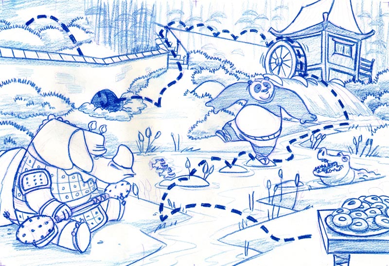
kung fu panda
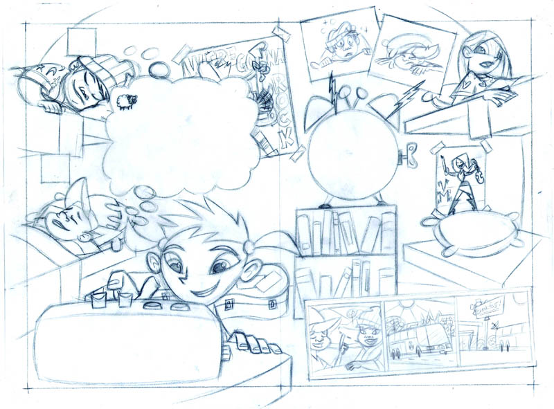
algorythmics
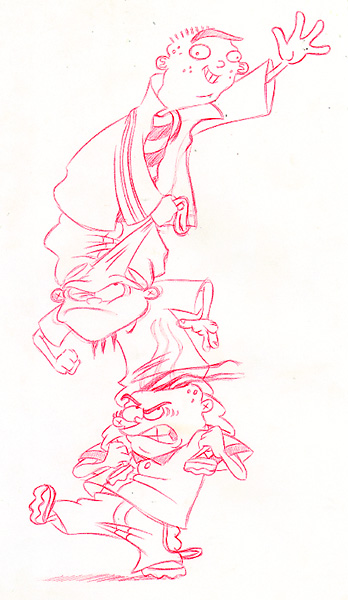
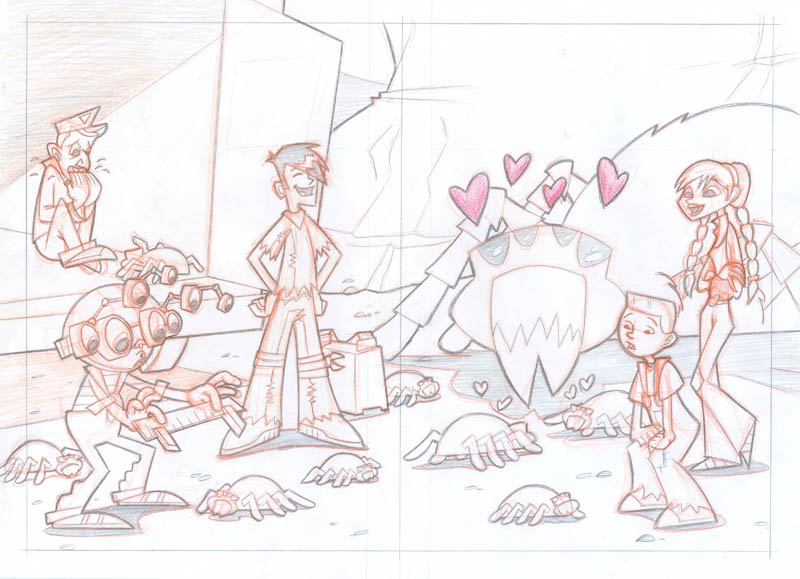
ed, edd, and eddy
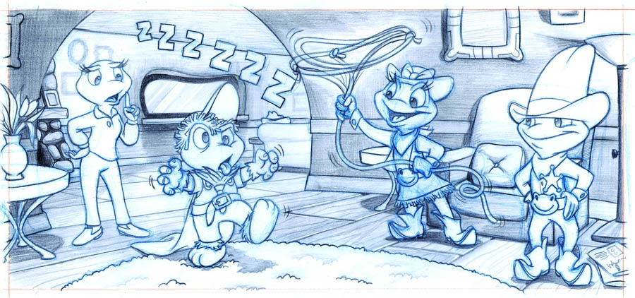
leapfrog- rainy day play
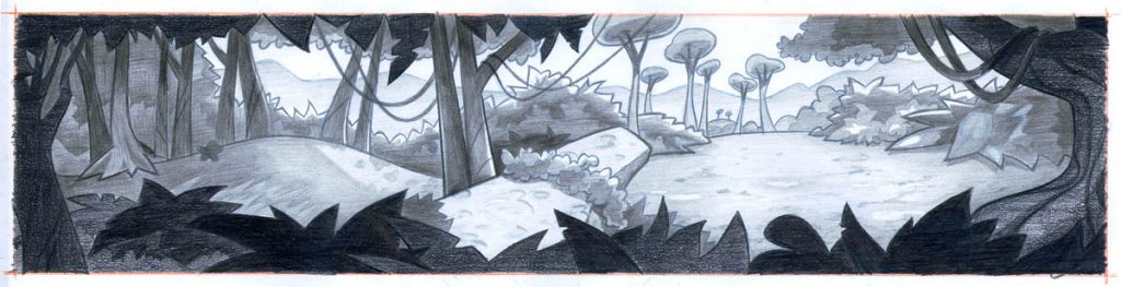
pencil- jungle mural
pencil- foster’s home for imaginary friends
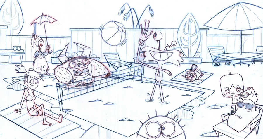
Bug Wranglers
End of content
No more pages to load